IP Addresses and Geolocation – Using GeoIP
Did you ever wonder how some sites are able to tailor a message specifically to your city? You might have seen these in ads: “Albuquerque mom loses 50 lbs!” Hmm. How did the site know you live in Albuquerque?
The answer is geolocation based on the user’s IP address. And of course, geolocation can be useful beyond tailoring custom ad messages. The good news? Free geolocation functionality exists!
Censorship on Facebook – Others can’t see your posts
Facebook seems to be employing a troubling, sneaky sort of censorship algorithm that is applied when people post to the pages of organizations, politicians, etc. It appears to be a form of the “Tachy goes to Coventry” ignore function seen on vBulletin, by which I mean: your posts are visible to you, and all appears perfectly normal; however, nobody else sees your posts. What makes this troubling is that it appears to happen via algorithm rather than human intervention, and there is no notification to the user that his or her posts are invisible to others. In fact, like the vBulletin functionality, it seems intentionally designed to mislead the user into believing his or her posts are appearing normally.
Royalty-free state flag icons
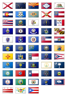
 I needed a set of US state flag icons, but I couldn’t find find a nice royalty-free, no-cost set in the size I wanted. So I went ahead and created the set on the left. I think it came out pretty well. The set includes all United States state flags plus Washington DC, the US Virgin Islands, and Puerto Rico. Each flag icon is 40 by 24 pixels. Some required minor cropping or width-extending to fit the uniform size, or to improve the clarity of symbols on the flag. Each flag has subtle shine and shadow effects to enhance their appearance.
Feel free to use these in your own project, commercial or non. All I ask is for a link back to this blog. Here is a zip file containing the 53 icons in PNG format. Each is a little over 1KB in size and is named after its two-letter postal code. See the included license.txt file as well. Do not re-sell this set or re-host it on any “free graphics” or “clip art” sites or collections, or I will come after you with my team of lawyers. Or ninjas. Or ninja lawyers. And you wouldn’t want that. =)
Feel free to let me know if you’ve found these useful by posting a comment below.
The Benefits of LED Displays on Laptops
LED displays began entering the laptop market back in 2007, though at the time they were offered on higher-end laptops only. These days LED displays are more common, even on budget models. What are the benefits of LED displays? In a nutshell, the LED screens are thinner, brighter, and more energy efficient than traditional displays.
Glossy Screens on Laptops Suck
I understand why glossy screens have completely overtaken matte screens; glossies look a lot sexier on display at the store. Images and videos are shown in vivid, eye-catching color and contrast that matte screens cannot achieve. However, the flaw of the glossy screen is easily overlooked at the store display.
I purchased a glossy screen model several years ago, when they were just becoming popular. It was not long before I noticed how much glare these screens pick up. They reflect light like a mirrored surface! In certain light conditions glossy screens are completely unusable, where a matte screen would be acceptable. I found myself often adjusting the screen, tilting it, turning it, to minimize the glare. It became a constant annoyance.
Now I’ve gone laptop shopping once again, and my local Best Buy no longer carries a single matte screen model. Glossies have completely overtaken. Where is the consumer choice? I realize that the colors on matte screens don’t “pop” like they do on glossies, but that’s a sacrifice I’d make to be rid of the annoying glare problem.
The few matte screen laptops I’ve found for sale online tend to be Thinkpads and other business-focused models. If I were to limit myself to matte screens only, my selection would be pretty thin. I guess I’ll likely suck it up and reluctantly go with a glossy.
UPDATE: what a sad, yet prescient comment (from 2006!) I came across on this topic:
The glare is terrible and you can’t use the laptop outside at all. The side viewing angle is totally destroyed because looking at the screen from the side looks just like a mirror.
What in the world were they thinking? I sure hope that this does not become a major trend.
Prefetching Javascript and CSS
Prefetching javascript and CSS files can improve the page load times as users navigate your site. This creates a better user experience and may even improve your search engine rankings.
I’ll describe an easy prefetch technique useful in situations in which you are reasonably sure the user will navigate from Page A to Page B. This situation typically involves the user filling out a form. Chances are high that if a user begins to fill out a form, she will eventually submit it, arriving at Page B. If you prefetch resources that will be needed by Page B, it’ll load faster when the user navigates to it. This is a technique I’m using on our lifespan test.
Using Amazon’s Cloudfront to host static files
The major players online use CDNs–Content Delivery Networks–to serve their static files, such as images, CSS and javascript files. CDNs have edge locations scattered around the world, so that when a user in Japan (for example) visits your page, he’ll be served all the static content from a server in Tokyo, even though your main web server may be located in the US.
In recent years, a number of CDNs have emerged that can affordably serve content for web sites that don’t have million dollar budgets. Amazon’s Cloudfront service is probably the cheapest, most accessible such CDN. Read more
Using custom fonts on web pages
When I design a web page, I rarely give very much thought to the fonts. My working assumption has always been that it’s best to just pick one of the half-dozen web-safe fonts and then move on to other design considerations. Usually I choose a sans-serif (Arial or Verdana) for most of a page’s text, because I think all the serifs on fonts like Times New Roman create too much visual noise.
But recently I’ve given more thought to braving the wild world outside of the standard web-safe fonts. This is possible thanks to the CSS construct @font-face, which recent browser versions have become better at supporting. Read more

