New Project Launched: Spectacular.Gift
It began like this: Amazon.com’s vast product catalog contains many clever and unique items, the sort that you may not know you wanted until you’ve heard of it. Alternately, these items might make an ideal gift when shopping for the person “who already has everything”. So I figured it would be a neat idea to curate a collection of these items and build a gift recommendation site around them. Doing so would allow me to explore some new server-side technologies and help keep my skills fresh.
Technologies used:
- Ubuntu VPS from Linode
- Apache2 HTTP server
- Apache Tomcat 7
- Apache ActiveMQ
- Spring 3.1 with Spring MVC
- PostgreSQL 9.3
- HTML5 + CSS3
- jQuery, flot, TinyMCE
- Java libraries such as Joda Time, Jsoup, Jackson, Logback, and Commons DBCP
- Amazon Product Advertising API
- Reddit REST API
To get some data populated in the database as a starting point, I set up a scheduled task to pull data from several Reddit forums where Amazon links are shared. Reddit conveniently makes this data available via their REST API. All products discovered in this way are set to unapproved status pending manual review.
Next, I set up another scheduled task to populate and refresh metadata about the products via Amazon’s Product Advertising API. Per Amazon’s terms in order to display price information, this data has to be refreshed hourly. For efficiency I request data on batches of ten products at a time, which is the maximum limit.
I created a manual process for reviewing and approving products to be shown. This process includes writing a custom description, adding relevant tags (e.g. “For Kids” or “Gadget Lovers”), and setting an age range and gender specificity (if applicable).
The UI is written in JSP and outputs HTML5. Some features are powered by javascript, such as the price history button which uses flot to render the graph of historical price data.
Spring 3.1 ties it all together. Spring MVC handles the front-end. Spring JDBC is used for interacting with PostgreSQL. I could have used Spring’s event system, but I wanted to get some experience with ActiveMQ. There are a number of message senders and listeners set up for events such as “price changed” or “product suggested”.
I’ll probably think of a snappier name eventually, but for now I registered http://spectacular.gift (new “.gift” TLD). Have a look if you like! It’s basically in beta, and I’m still adding new products and tags.
Easy CSS Ribbons / Banners (with an assist from SVG)
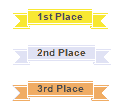
Ribbons, banners, whatever you’d call them. Put some text inside a ribbon using only markup like this:
<span class="ribbon">1st Place</span>
<span class="ribbon silv">2nd Place</span>
<span class="ribbon brnz">3rd Place</span>
And it should look like this:

So I created a fairly simple ribbon vector image using Adobe Illustrator, saved to SVG format, and hand-edited it to this:
Recreating a Logo in SVG (from a PNG)
This is the hdpi logo for GoToQuiz.com, in PNG format:

It’s file size is only 3.83KB, which isn’t bad at all. And it looks crisp on hdpi screens. But I wanted to try recreating it in SVG anyway, mainly as a learning exercise.
Getting the basic outline of the letters was easy, given how blocky they are. I had Adobe Illustrator trace them and output the result as an SVG. This would be my starting point for hand-coding the rest.
First, I rounded off each point that Illustrator generated to integers. For such simple shapes, integers really just make it easier to ensure everything is lining up. A few lines ended up a pixel off from where I wanted them, but that was easy to correct. So this was my starting point:
Really Cool Glossy Progress/Result Bars in Pure CSS
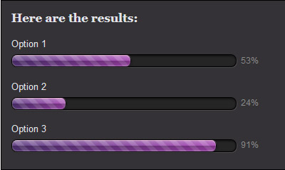
Inspired by this progress bar design, I decided to recreate the look using CSS. The end result is this:
The bars above were created purely with CSS (taking advantage of CSS3 properties such as linear-gradient and box-shadow), supported by all recent browsers versions except IE9 and below. Here is how, beginning with the HTML code.
<div id="container">
    <p id="title">Here are the results:</p>
    <p>Option 1</p>
    <!-- .barOuter is the box containing the bar,
         .barInner is the bar itself -->
    <div class="barOuter"><div class="barInner" style="width: 53%;"></div><div class="barLabel">53%</div></div>
    <p>Option 2</p>
    <div class="barOuter"><div class="barInner" style="width: 24%;"></div><div class="barLabel">24%</div></div>
    <p>Option 3</p>
    <div class="barOuter"><div class="barInner" style="width: 91%;"></div><div class="barLabel">91%</div></div>
</div>
CSS3 Styled Progress Bar
The quiz results on GoToQuiz are, more or less, progress bars. They visually depict your quiz result as it falls between 0% and 100%, inclusive. How would one go about creating an attractive progress bar entirely in CSS3? I’ll quickly show how I did it.
First, this is what the old bars look like:
It’s a <div> inside a <div> with some simple styling. The inner <div> is set to a reddish background and given a width as a percentage–80%, in the example above. This is a simple bar that communicates what it needs to, whether as a quiz result, poll result, or progress bar, but it’s not visually appealing. In contrast, this is what the new bar looks like:
This is done without any images, which would require additional requests to the server and are best-avoided when CSS is up to the job. And it works in all modern browsers (although IE < 10 will not stripe the unfilled portion of the bar).
First, here is the HTML for the progress bar: Read more
Royalty-free image sources
Image copyright can be a thorny issue, and most web designers are not legal experts. But you’ve got to be confident that you have the right to use any image you place on your site. If you need an image for free, there are a few sources available. Two are PD Photo (PD standing for Public Domain) and the public domain category of Wikimedia Commons. In fact, all images used on Wikipedia display copyright information when you click on them. If the image has an expired copyright, you can use it royalty-free.
Another option is to check the Prints & Photographs Online Catalog at the US Library of Congress web site. Not every image there is free from copyright restrictions, so always double check. Here is their info page on copyright.
stock.xchng used to be a good source of free images, however they’ve been bought by GettyImages and require payment now for most of the available content. If you are willing to pay a small fee, I’ve had a good experience with Dreamstime (they’ve recently added a free section, too).
Another possibility is to buy one of those stock image collections, such as Big Box of Art or Art Explosion. You get a huge number of searchable, royalty-free images. A lot of the images are not the best quality, but some are useful.
One final note: always read the fine print. Even “royalty-free” can have stipulations. If the image features a person, also look for an indication that a model release form was signed (if your project is commercial).
UPDATE: I recently found this free image site that provides you with the Photoshop PSD files.
Royalty-free state flag icons
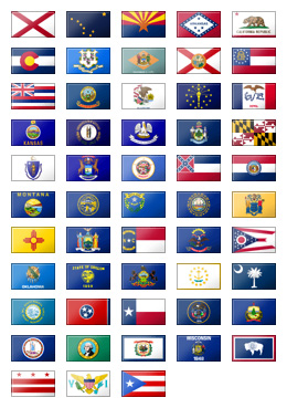
 I needed a set of US state flag icons, but I couldn’t find find a nice royalty-free, no-cost set in the size I wanted. So I went ahead and created the set on the left. I think it came out pretty well. The set includes all United States state flags plus Washington DC, the US Virgin Islands, and Puerto Rico. Each flag icon is 40 by 24 pixels. Some required minor cropping or width-extending to fit the uniform size, or to improve the clarity of symbols on the flag. Each flag has subtle shine and shadow effects to enhance their appearance.
Feel free to use these in your own project, commercial or non. All I ask is for a link back to this blog. Here is a zip file containing the 53 icons in PNG format. Each is a little over 1KB in size and is named after its two-letter postal code. See the included license.txt file as well. Do not re-sell this set or re-host it on any “free graphics” or “clip art” sites or collections, or I will come after you with my team of lawyers. Or ninjas. Or ninja lawyers. And you wouldn’t want that. =)
Feel free to let me know if you’ve found these useful by posting a comment below.
Using custom fonts on web pages
When I design a web page, I rarely give very much thought to the fonts. My working assumption has always been that it’s best to just pick one of the half-dozen web-safe fonts and then move on to other design considerations. Usually I choose a sans-serif (Arial or Verdana) for most of a page’s text, because I think all the serifs on fonts like Times New Roman create too much visual noise.
But recently I’ve given more thought to braving the wild world outside of the standard web-safe fonts. This is possible thanks to the CSS construct @font-face, which recent browser versions have become better at supporting. Read more


